


Most staffing plans fall apart in the gap between what happened and what someone thinks is going to happen. A manager stares at last month's schedule, remembers it "felt busy," and pads the next roster by two people. Three weeks later payroll is over budget and nobody can explain why. Meanwhile the demand signal was sitting right there — buried in punch-in and punch-out records, appointment start times, ticket timestamps, and shift-close events nobody ever converted into anything useful.
You're already collecting the raw material for a real forecast. Every canonical time event — a clock-in, a job start, a service completion, a swipe at a terminal — is a tiny demand signal. The problem is almost never a lack of data. It's that the data never gets shaped into something a manager can run on a Monday morning to decide how many people to schedule for the following Tuesday.
This is a blueprint for doing exactly that. Not a data-science lecture, and not a pile of dashboards. A working system that takes the time events you already own, turns them into demand signals, runs them through forecasting recipes anyone on your team can execute, and produces staffing scenarios with clear decision thresholds. Deterministic baselines first — boring, reliable, criminally underused — then simple probabilistic templates, then a 90-day pilot you can actually finish.
Why forecasting off time data breaks in most businesses
The failure isn't mathematical. It's structural. Here's the pattern that shows up over and over.
Businesses treat time data as a payroll byproduct. It exists to pay people, so once payroll runs, nobody looks at it again. The timestamps are never cleaned, never aligned to a canonical clock, and never joined to the thing they're supposed to predict — demand. You end up with clock events in one system, appointments or work orders in another, and no shared spine connecting them.
The second failure is granularity mismatch. A retail manager forecasts by day ("Saturdays are busy") when the real signal lives at the half-hour level. Saturday might average out to moderate, but 11am–2pm is a wall and 4pm–close is dead. Staff a flat Saturday crew and you're overstaffed for four hours and drowning for three. Daily averages hide the exact intervals where coverage decisions matter most.
Third — and this is the sneaky one — data quality is bad enough to poison any forecast, but nobody notices because payroll still "works." Missing punches, duplicate events, terminal clock drift across locations, timezone inconsistencies — all of it quietly distorts the signal. If you haven't governed those events into a clean, reconciled stream, forecasting is building on sand. This is why a solid canonical time-data architecture matters before you attempt any of this. The recipes below assume your events are deduplicated, timezone-normalized, and reconciled to a single source of truth.
What tends to happen at smaller operations is that the forecast doesn't fail loudly. It just quietly never gets built, and staffing stays a gut call forever.
The core idea: canonical events → demand signals → recipes
Before any math, get the mental model straight. Three transformations, and each one is a place things can break.
Accurate time tracking made effortless.
GoTimio empowers your team to log, monitor, and manage work hours seamlessly.
- Real-time time tracking
- Automated timesheet approvals
- Payroll and billing integration
No credit card required
1. Canonical time event → demand unit. A raw event ("employee 44 clocked in at 08:57 at Location B") isn't demand. You have to decide what the demand unit is for your business. For a clinic it might be "appointments started per 30-min interval." For a warehouse, "orders picked per hour." For a café, "transactions per 15-min slot." The unit has to be something staffing directly drives.
2. Demand unit → demand signal. Now you aggregate those units into a time series with consistent buckets. This is where most people get sloppy. Your buckets must be identical across weeks — same interval length, same boundaries, same timezone — or comparisons are meaningless.
3. Demand signal → staffing requirement. Finally you convert predicted demand into people. This needs a productivity ratio: how much demand one staffed person handles per interval. If one server handles roughly 18 covers per hour comfortably, and you forecast 72 covers at 7pm, you need 4 servers, not 3.
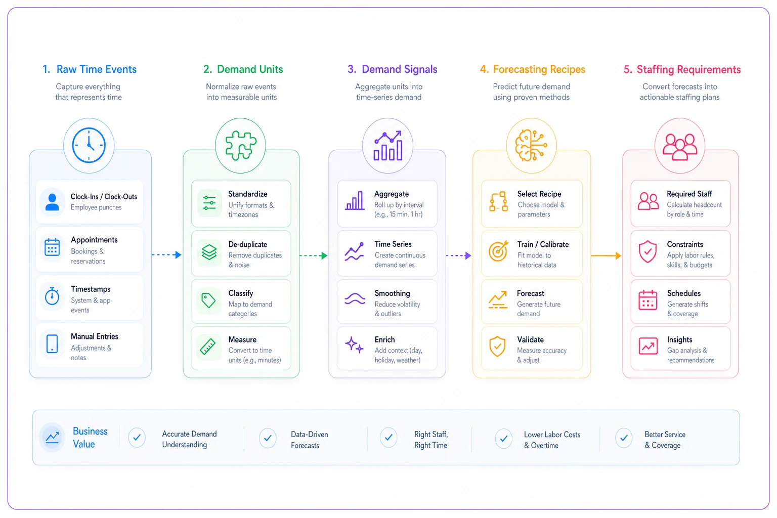
A simple flow like this helps teams align on the transformations.
Here's the insight most managers miss: the forecast is the easy part. The hard part is a stable, honest productivity ratio. A wrong ratio breaks everything downstream, and it's the number people fudge the most because it's uncomfortable to nail down — "are we saying one person should handle that much?"
Deterministic baselines: start here, always
Skip the fancy stuff first. A deterministic baseline is a forecast with no probability, no confidence interval — just a rule applied to historical patterns. Ugly, and it works about 80% as well as complicated models for a fraction of the effort.
Three baselines worth knowing. Build all three, because comparing them tells you a lot.
Same-interval average (seasonal naive). Predict next Tuesday 2pm by averaging the last 4–6 Tuesdays at 2pm. That's it. Shockingly effective for businesses with stable weekly rhythms.
Trailing weighted average. Same idea but weight recent weeks more heavily — last week counts double, for example. Better when demand is drifting up or down.
Day-shape method. Take a typical day's shape (the relative proportion of demand across intervals) and scale it by a predicted daily total. Useful when daily volume moves but the intra-day pattern stays consistent.
Here's a sample the way a manager would actually see it. Forecasting Tuesday coverage for a service desk, demand unit = tickets opened per hour:
| Hour | Last 4 Tuesdays (avg) | Weighted (recent x2) | Forecast used | Tickets/agent/hr | Agents needed |
|---|---|---|---|---|---|
| 9am | 14 | 16 | 16 | 6 | 3 |
| 10am | 22 | 24 | 24 | 6 | 4 |
| 11am | 27 | 26 | 27 | 6 | 5 |
| 12pm | 19 | 18 | 19 | 6 | 3 |
| 1pm | 25 | 28 | 28 | 6 | 5 |
| 2pm | 21 | 20 | 21 | 6 | 4 |
Notice how the two baselines disagree at 10am and 1pm — that disagreement is information. When baselines diverge a lot, that interval is volatile and deserves a human look or a probabilistic treatment. When they agree tightly, trust the number and move on.
Tag anomalous days at the source and exclude them from the training window.
One mistake people make here: they average across intervals that aren't comparable. A holiday week, a one-off promo, a system outage that suppressed ticket volume — leave those out or your "average Tuesday" is contaminated. Tag anomalous days at the source and exclude them from the training window.
Simple probabilistic templates (without a data science team)
Deterministic gives you a single number. But staffing is really a question about risk: how bad is it if demand comes in higher than expected? A probabilistic template answers "how many people do I need to handle demand 80% of the time?" or "95% of the time?"
You don't need a stochastic model for this. Two lightweight approaches cover most small businesses.
Empirical percentiles. Instead of averaging the last 6 Tuesdays at 2pm, take the full distribution and pull the percentile you care about. If the last 8 Tuesdays at 2pm were 18, 21, 19, 25, 22, 30, 20, 24 — the average is around 22 but the 90th percentile is closer to 28. If understaffing at 2pm causes SLA breaches or walkouts, staff to the 28, not the 22.
Simple range-based buffer. For each interval, compute the average and the standard deviation across your training window. Staff to average + some multiple of deviation depending on how much you hate being caught short. High-consequence intervals — a clinic's morning rush, a restaurant's Friday dinner — get a bigger buffer. Low-consequence ones run lean.
The genuinely useful move is to set your service level by interval, not by day. Understaffing at a dead hour costs you nothing. Understaffing at peak costs revenue, generates overtime later, or creates a compliance problem. So you spend your buffer where it matters and run tight everywhere else. Most businesses do the opposite — uniform buffer across the whole shift — which is why they're simultaneously overstaffed and understaffed on the same day.
One pattern worth calling out: interval-level variance is itself a diagnostic. If one interval is wildly unpredictable week to week, that's often not random — it's an upstream process problem. Inconsistent appointment scheduling, a marketing send that lands at unpredictable times, a supplier delivery window that drifts. The forecast surfaces the operational mess before it fixes anything.
Decision thresholds: turning forecasts into actions
A forecast that doesn't trigger a decision is just trivia. You need explicit thresholds that convert numbers into "do this."
-
Coverage gap threshold. If forecasted requirement exceeds scheduled staff by more than X — say, 1 full person for 2+ consecutive intervals — trigger a schedule adjustment before the week locks.
-
Overstaff threshold. If scheduled staff exceeds forecasted requirement by more than X for several intervals, flag for a voluntary early-out or send-home offer, or shift someone to backlog/prep work.
-
Volatility threshold. If your deterministic baselines disagree by more than X%, or interval variance is high, escalate to a manager decision instead of auto-scheduling.
In practice: each week the forecast runs against the draft schedule. Every interval gets tagged green (within tolerance), amber (gap or surplus inside threshold), or red (over threshold). Managers only touch the reds and ambers — maybe 15% of intervals — instead of re-planning the whole week from scratch. That's the entire point: the system narrows attention to the decisions that actually move cost or service.
The mistake here is setting thresholds too tight. If everything trips a flag, managers ignore all of them and you're back to gut feel. Start loose, tighten as trust builds.
A 90-day pilot playbook
Don't roll this out company-wide. Pick one location or one department with reasonably clean data and run a contained pilot. Here's the sequence.
-
Weeks 1–2 — Pick the unit and pull the data. Define your demand unit and productivity ratio. Extract 12+ weeks of clean, reconciled time events for the pilot area. Tag and exclude known anomalies. If your events aren't reconciled yet, stop and fix that first — everything downstream inherits the mess.
-
Weeks 3–4 — Build deterministic baselines. Stand up all three baselines in a spreadsheet or your analytics tool. Backtest: pretend you're forecasting past weeks and compare to what actually happened. Record the error per interval.
-
Weeks 5–6 — Add probabilistic layer. Compute empirical percentiles for high-consequence intervals only. Decide service levels per interval band — peak vs. shoulder vs. dead.
-
Weeks 7–8 — Set thresholds and shadow-run. Run the forecast against real schedules without acting on it yet. Watch how often it would have caught a real gap or surplus. Calibrate thresholds against reality.
-
Weeks 9–12 — Go live on the pilot. Managers now act on amber/red flags. Track two numbers: forecast error trend and the operational outcome you care about — overtime hours, SLA breaches, walkouts, idle labor cost.
Pilot readiness checklist
-
[ ] Time events are deduplicated, timezone-normalized, and reconciled
-
[ ] A single demand unit is defined and directly tied to staffing
-
[ ] A defensible productivity ratio exists (and someone owns it)
-
[ ] At least 12 comparable weeks of history are available
-
[ ] Anomalous days are tagged and excludable
-
[ ] Someone owns the weekly forecast run (not "the team")
-
[ ] Thresholds are written down before go-live
-
[ ] A clear success metric is chosen — cost or service, not "accuracy"
At the end of 90 days you're not judging whether the forecast is "accurate" in some abstract sense. You're judging whether it changed decisions and whether those decisions saved money or improved service. If it didn't change any decisions, either your thresholds are wrong or your business genuinely runs fine on gut — which is a valid finding.
A real scenario
A regional urgent-care clinic with two sites was scheduling front-desk and MA coverage off a flat weekday template — same six people every day, 8am to 6pm. Wait times spiked mid-morning and the last two hours were dead, but the schedule never moved because that's just how they'd always staffed.
They pulled roughly 14 weeks of check-in timestamps, bucketed to 30-minute intervals, and built the same-interval average baseline. The intra-day shape was stark: check-ins peaked 9:30–11:30, dipped hard over lunch, had a small afternoon bump, and cratered after 4pm. The flat template was overstaffing the last two hours by about 1.5 FTE-equivalents daily and understaffing the morning by roughly the same amount.
They didn't add headcount. They re-sloped the existing shifts — staggered starts to load the morning, trimmed the tail end — and staffed peak intervals to the 85th percentile instead of the average. Over the following two months, mid-morning wait times dropped noticeably and monthly overtime fell somewhere in the $2k–$3k range across both sites, mostly from cutting the dead-hour coverage that used to bleed into overtime elsewhere. Nothing exotic. They just stopped staffing a flat average against a spiky demand curve.
When this makes sense — and when it doesn't
This works well when your demand has repeating structure — weekly, intra-day — staffing is a meaningful cost, and you have at least a couple months of reasonably clean history. Service businesses, clinics, retail, support desks, warehouses, restaurants — all strong fits.
This is a bad idea when your data is a mess and you haven't fixed it. Forecasting on dirty time events produces confident, wrong numbers, which is worse than admitting you don't know. Fix reconciliation first.
Who should skip it: very small teams where staffing is basically fixed — you have three people and they all work every shift — and businesses whose demand is genuinely random with no exploitable pattern. Some emergency and project-based work truly is unpredictable. If your baselines backtest no better than a coin flip, don't force it.
One honest caveat: this is a tool for capacity planning, not real-time firefighting. It tells you how to build next week's schedule, not how to react to a surprise rush at 2pm today. Those are different problems.
Where the system connects to the rest of your operation
A forecast doesn't live alone. The productivity ratio you use here is the same ratio that should show up in how you allocate labor cost — which ties directly into turning tracked hours into a defensible P&L. If you're already doing cost allocation on tracked hours, your forecast and your profitability model should be speaking the same language, not contradicting each other.
And the whole thing needs an owner. Forecasts rot fast when nobody maintains the productivity ratios or re-tags anomalies. This is exactly the kind of recurring discipline that belongs inside a time-data Center of Excellence — someone accountable for the weekly run, someone reviewing forecast error monthly, someone deciding when a threshold needs tightening.
The businesses that get real mileage out of time-data workforce forecasting aren't the ones with the fanciest models. They're the ones who built a clean event stream, picked an honest demand unit, ran a boring deterministic baseline, and actually changed a schedule because of it. The math is the small part. The system around it — clean inputs, clear thresholds, a named owner, a decision that actually gets made — is where the value lives.
Ready to optimize your workforce time management?
Join 2,000+ companies using GoTimio to improve timesheet accuracy, reduce payroll errors, and boost team productivity.